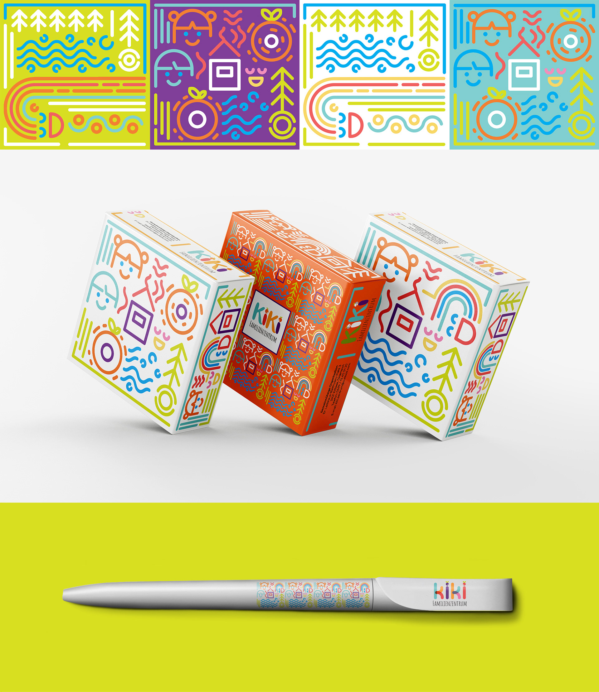
Branding and Identity for Kiki Familienzentrum
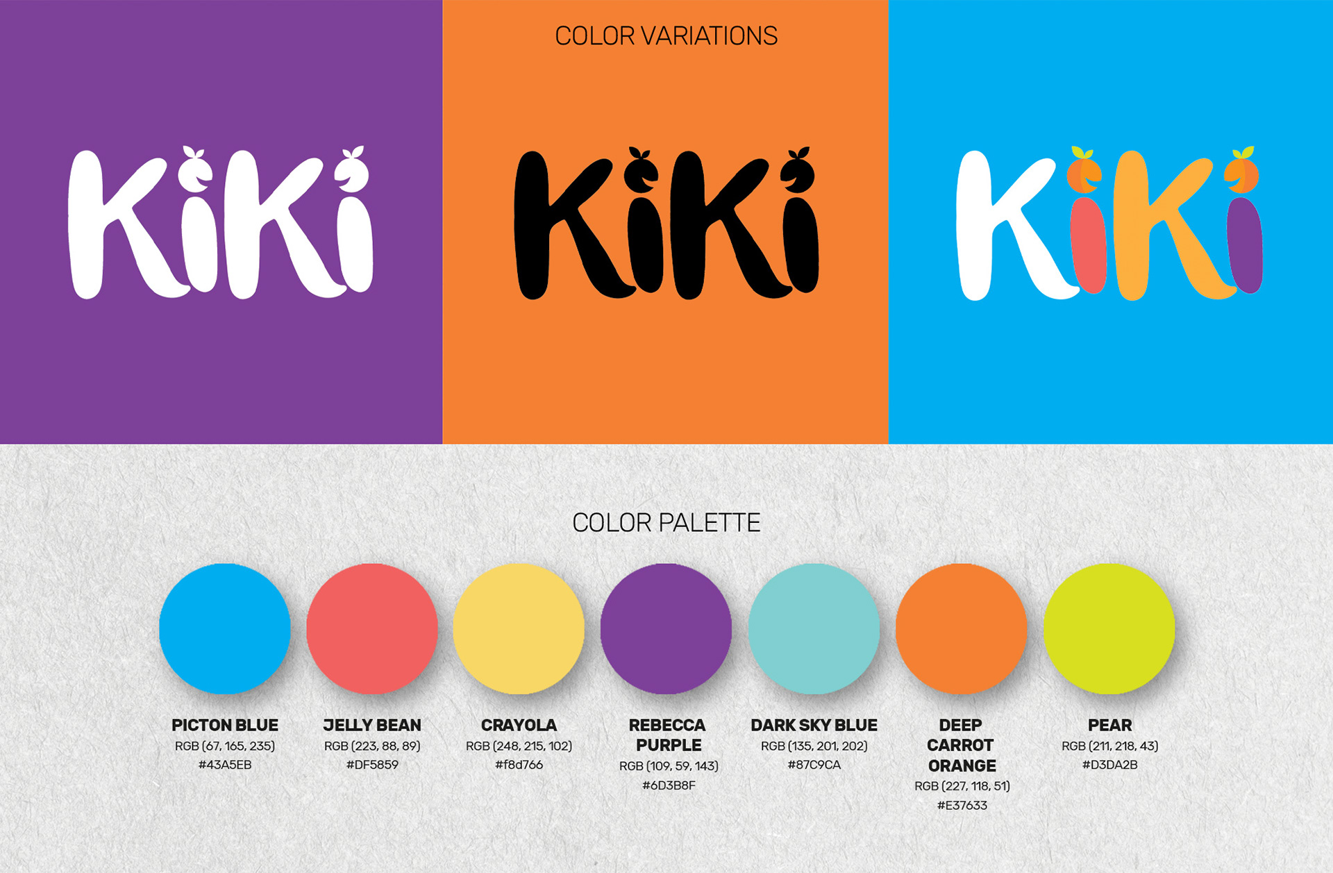
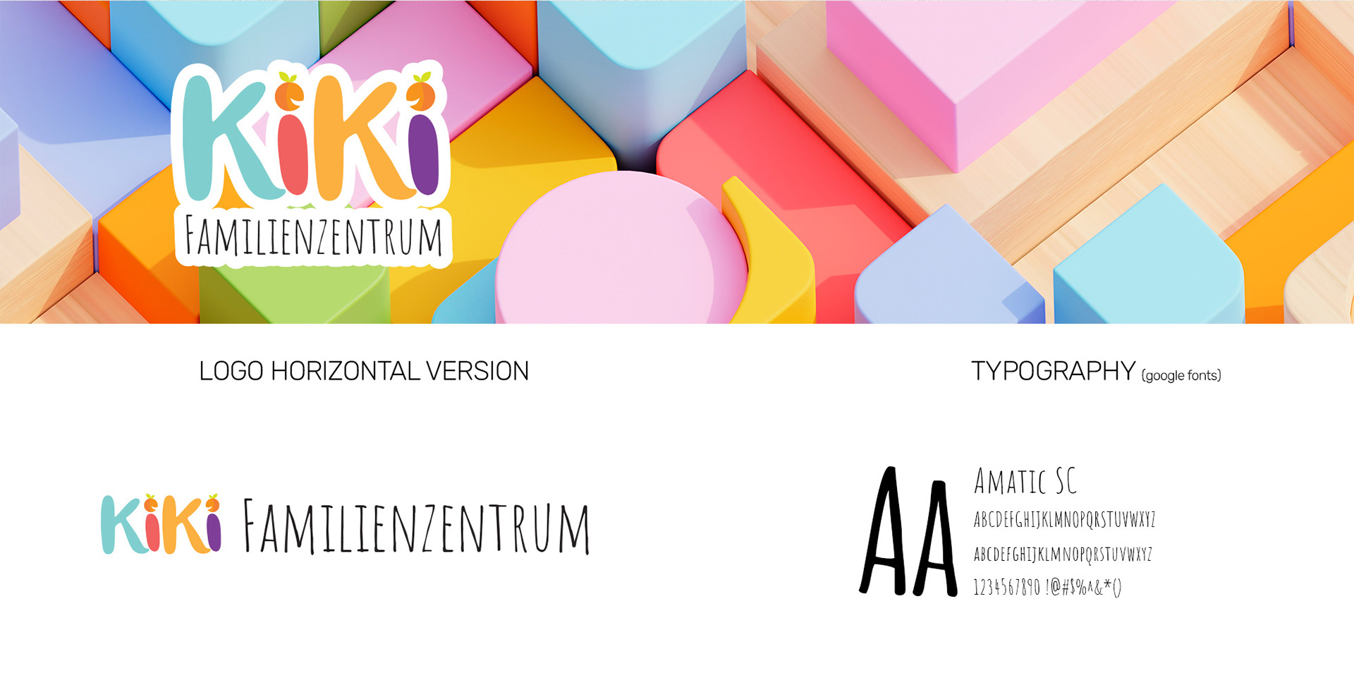
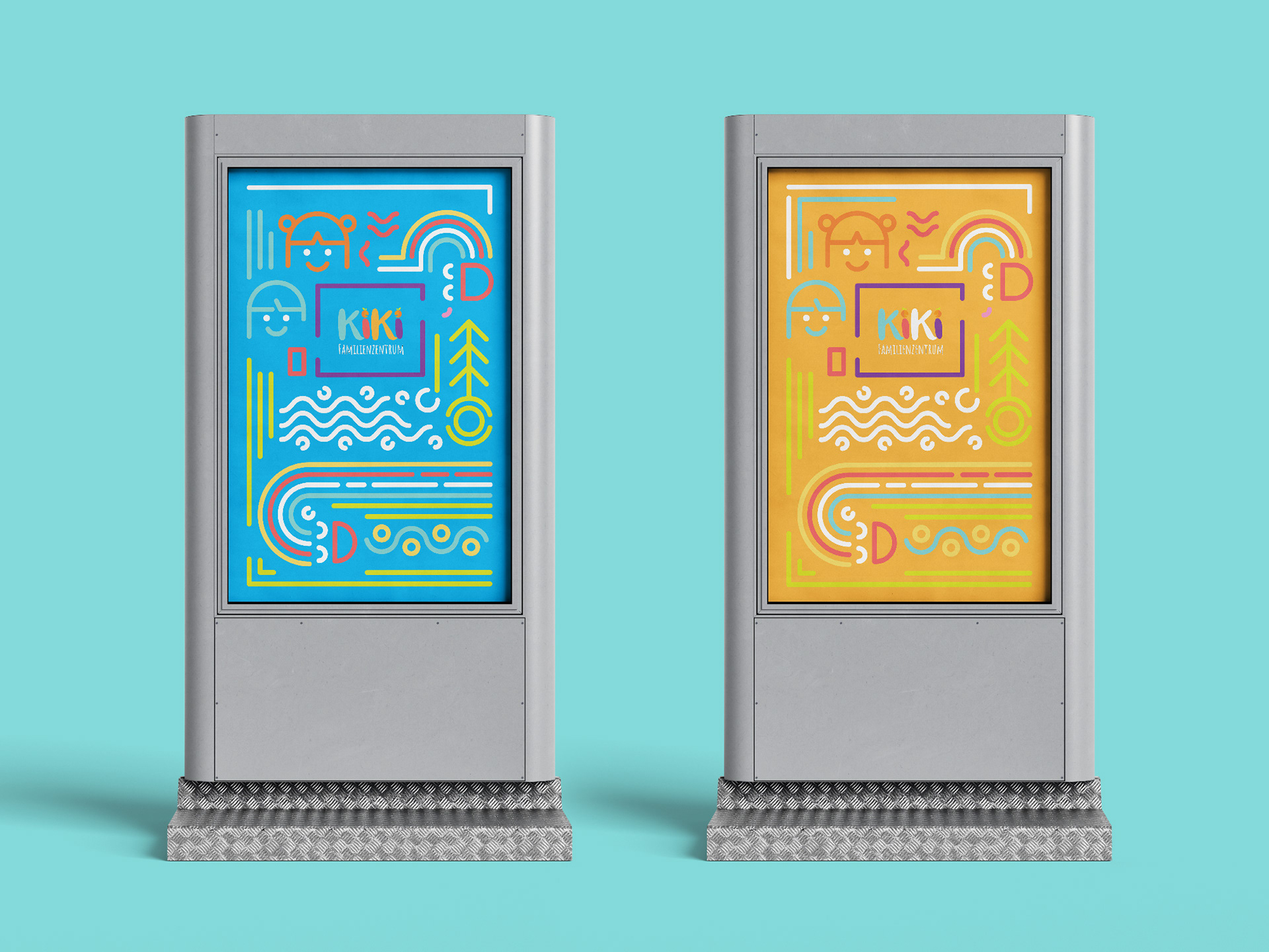
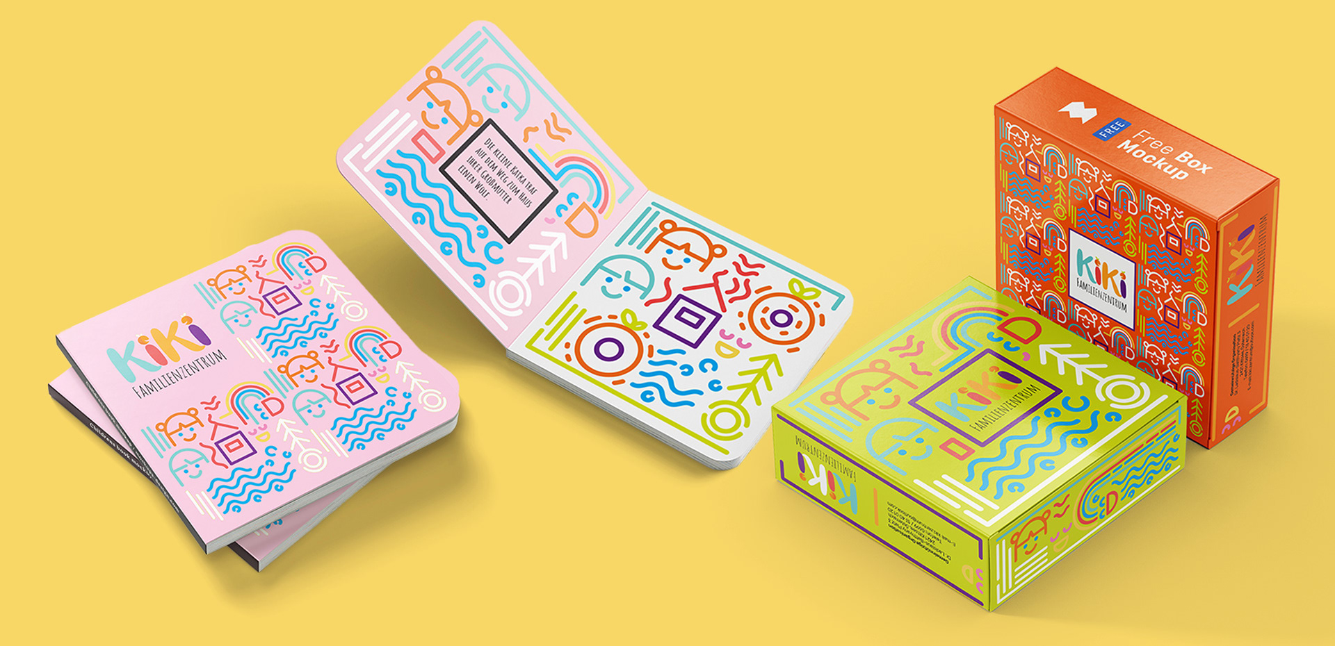
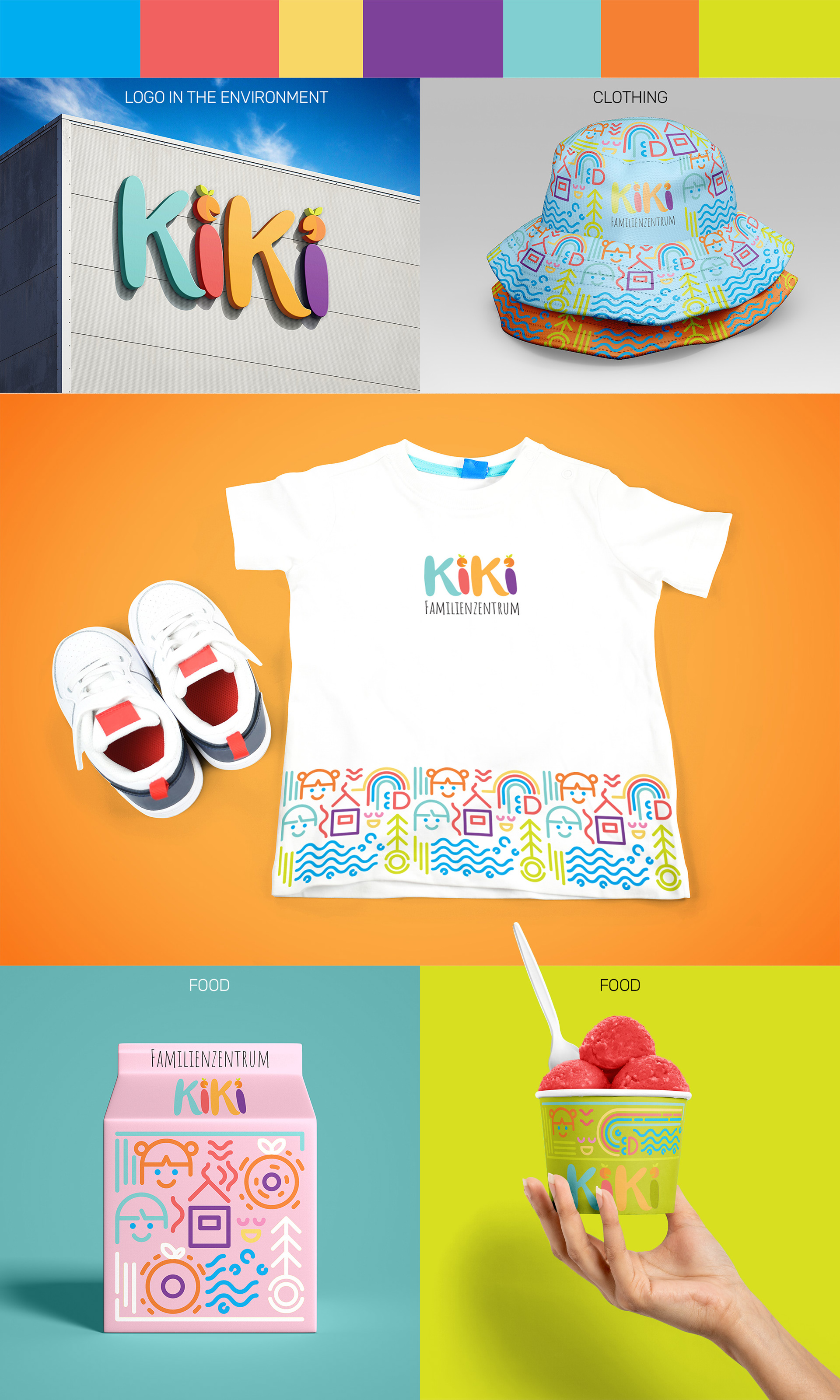
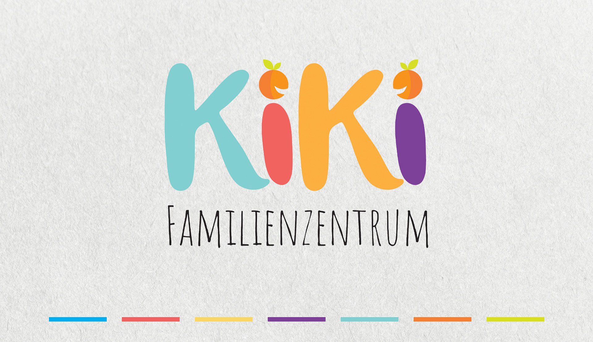
This visual identity project for Kiki Familienzentrum (Family Center) in Kittsee masterfully blends playful, child-friendly design with a strong sense of local identity. The logo features a bold, rounded typeface, where each letter of the name KIKI is assigned a distinct color—blue, red, orange, and purple.
The playful character of the brand is further enhanced by the cheerful faces formed by the dots above the letters “i.” A key feature of the design is that these dots are cleverly stylized to resemble apricots, a prominent symbol of the Kittsee region. This element not only gives the logo a cheerful and approachable feel but also embeds a deep, regional significance.
Below the main logo, the text “FAMILIENZENTRUM” is set in the soft, handwritten-style Amatic SC font from Google Fonts. This choice adds a personal and communal touch, perfectly complementing the primary logo and reinforcing the center’s welcoming nature. The overall visual branding effectively communicates joy, openness, and a nurturing environment—all essential qualities for a family-focused institution.